Most React components are configured with props. You pass open={isOpen}, you wire onClose={setIsOpen}, you squeeze the title, description, and footer into the right place. It works, but it’s clunky. The component becomes a dumping ground of props.
Compound components flip that around. Instead of cramming everything into one interface, you get a parent–child system.
What are compound components?
Compound components are a React pattern where a parent manages shared state and logic, and its children access that state through context.
- The parent (often called
Root) owns the rules: whether a dialog is open, which tab is active, what item is selected. - The children consume that context invisibly. They don’t need their own props; they just “know” what the state is.
- As a developer, you declare the pieces directly in JSX and arrange them however feels natural.
Instead of configuration, you get composition. The code looks like the UI itself.
Why it matters
With a prop-heavy API, structure is hidden inside props:
<Modal
open={isOpen}
onClose={setIsOpen}
title="Delete account"
description="Are you sure?"
footer={<Button>Confirm</Button>}
/>With compound components, the structure is declared in place:
<Modal>
<Modal.Title>Delete account</Modal.Title>
<Modal.Description>Are you sure?</Modal.Description>
<Modal.Footer>
<Button>Confirm</Button>
</Modal.Footer>
</Modal>Each piece matches what you see on screen. It’s clearer, easier to read, and simpler to rearrange.
How it works under the hood
At the core, the parent holds the state and exposes it through context. The children read from that context and update it when needed.
That means you don’t have to wire props between them. You just drop the children into your JSX, and they automatically connect to the parent.
The state stays centralised, but the way you build your UI stays flexible.
A minimal example
Here’s a basic toggle switch using the pattern:
const ToggleContext = React.createContext(null);
function Toggle({ children }) {
const [on, setOn] = React.useState(false);
return (
<ToggleContext.Provider value={{ on, setOn }}>
{children}
</ToggleContext.Provider>
);
}
function ToggleButton() {
const { on, setOn } = React.useContext(ToggleContext);
return <button onClick={() => setOn(!on)}>{on ? "On" : "Off"}</button>;
}
function ToggleStatus() {
const { on } = React.useContext(ToggleContext);
return <span>{on ? "Enabled" : "Disabled"}</span>;
}
Usage:
<Toggle>
<ToggleButton />
<ToggleStatus />
</Toggle>No props are passed between children. Both “just know” the state because the parent provides it.
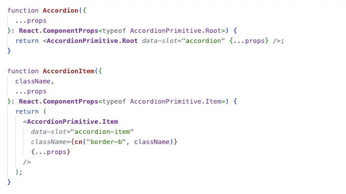
Why Radix and shadcn use it
Radix primitives like Dialog, Tabs, and DropdownMenu all follow this pattern. shadcn then layers styling, variants, and Tailwind utilities on top.
The benefits are clear:
- Accessibility → features like focus traps, aria attributes, and keyboard navigation need centralised state.
- Flexibility → developers can rearrange pieces however they want without breaking behaviour.
- Composability → with
asChild, you can swap in your own elements and still inherit the logic.
That’s why these libraries feel so seamless to use. Because they take care of the wiring, but leave you in control of structure.
Trade-offs
- Hidden state flow → context makes things less obvious at a glance.
- Parent required → children won’t work outside the right root.
- Portal quirks → some components render in a portal, which can affect stacking and z-index.
These are minor costs compared to the clarity and flexibility you gain.
The magic in plain sight
The "magic" of Radix and shadcn isn’t hidden code. It’s this simple pattern:
- The parent manages the rules.
- The children play their roles.
- Context is the invisible glue.
Compound components turn props into context and configuration into composition. Once you see the pattern, you start spotting it everywhere.
